Profiling Basics
Designer Cloud Powered by Trifacta Enterprise Edition surfaces visual representations of your data for individual columns and the entire dataset. These visual profiles enable you to make quick assessments of problems, unusual patterns, and required changes to your data.
Tip
Visual profiling is especially important in recipe development. When you identify something of interest, you can select the visual representation of it, and the platform prompts you with a set of suggested transforms to add to your recipe. Examples are below.
For more background information, see Overview of Visual Profiling.
Profile Source Data
Tip
When you first load your dataset into the application, you might want to run a job to profile your dataset before you build your recipe. The generated results and profile are accessible through the application, which can be useful for seeing how your dataset has changed during development. For more information, see Profile Your Source Data.
Profiling in the Application
In the Trifacta Application, there are a number of features that provide visual information on the status of individual columns, their data, and the overall dataset.
Note
Before your job is run, profiling information such as column statistics are exact counts of the sample that is currently loaded. After the job is run, profiled results in the Job Results page might include estimates for some metrics and counts, depending on the scale of the dataset.
Status Bar
Counts on the rows, columns, and data types in the current sample are displayed at the bottom of the page in the status bar.
Tip
Sample counts are used for profiling when in the Transformer page. When a visual profile is generated as part of your job, the counts are taken from the entire dataset.
 |
Figure: Status Bar
Column Header
The top of each column contains a data quality bar, which identifies the valid, mismatched, and missing values in the column when compared against the specified data type, and column histogram, which identifies the range of values in the column.
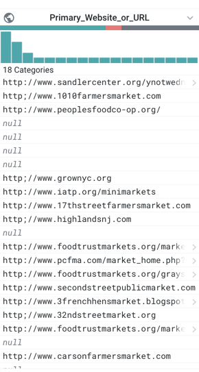
Figure: Example Column
Data Quality Bar - missing and mismatches values
Below the name of the column, the multi-colored band indicates the valid (green), mismatched (red), and missing (gray) values in the column, when matched against the column's data type. In the above image, the data type is set to URL.
Tip
Click the missing or mismatched values in a column's data quality bar. You are prompted with suggestions of transformations to fix or remove these values.
Column Histogram
Each column includes a histogram of the values in the column. In the above image, there are 402 different values in the column, and you can see how some values appear more frequently than others.
Tips:
In the column histogram, you can select a column value and drag to select a range of values for suggestions on transformations.
Null values are a special case of missing values. You can use the
ISNULLfunction to identify null values in a column, which appear among the category of missing values. See Manage Null Values.When you select one or more values in the column histogram, you can see the corresponding values for the row values in the histograms for other columns.
See Column Histograms.
Column Details - statistics and outliers
In the Column Details window, you can review key statistical information on the values in a column. Displayed statistics are based on the column's data type.
To explore the details for a column's data, select Column Details from the drop-down for the specific column in the data grid.
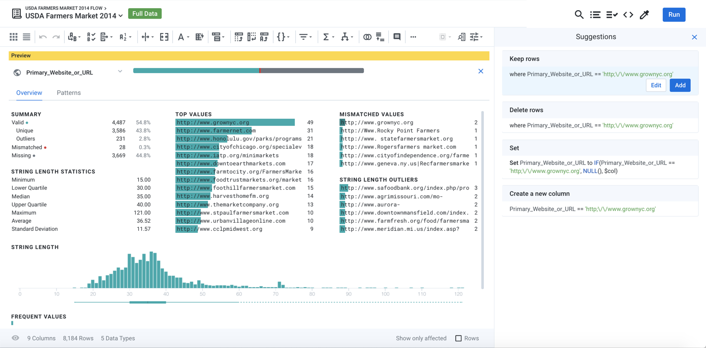
Figure: Column Details
For the selected column, you can review key statistics depending on the data type. The above image shows statistics that apply to the URL data type, which is a variation on String type.
Tips:
Make a selection from the lists of top, mismatched, and other value lists to be prompted for a set of suggestions for how to modify the selected rows.
Transform suggestions are updated based on your selection.
Click the missing values in the data quality bar to prompt for suggestions to address those values in the column.
See Column Details Panel.
Column Browser - profiles across columns
In the column browser, you can view visual histograms for each column in the dataset and make selections to identify correlations between values in multiple columns. To open the column browser, click the Columns icon in the Transformer bar.
For more information, see Column Browser Panel.
Profile Jobs
When you execute your job, you can generate a visual profile of the entire dataset as part of the job. You can use the generated profile to simplify iteration on your recipe. The optional profiling of the results can take extra time to generate.
Steps:
In the Transformer page, click Run.
Click the Profile Results checkbox.
Run the job.
When the job finishes, click the Job Id link. Then, click the Profile tab in the Job Details page.
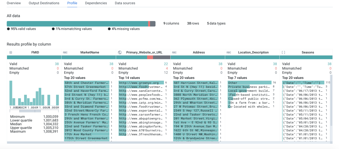
Figure: Visual Profile
This visual profile displays statistics across the entire dataset. Since the data volume of the entire dataset can be quite large, these stats may be approximations.
Download visual profile
From the Profiles tab, you can download your job's visual profile to your desktop.
See Job Details Page.